.webp)
Opening now...

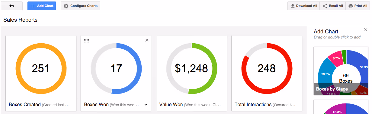
Think back to the original reason that you started using Streak — whether you were looking to sell more, improve support for your users, manage your dealflow, or coordinate your hiring — you wanted to improve. So that you can better measure your pipeline performance over time, we’ve completely rebuilt our Reporting feature. We’re excited to show you the rebuilt interface and all-new charts! Before we dive into details, a quick teaser:
Expanded Configuration options
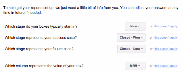
Reporting now understands where your process begins and what represents success versus failure. Spoiler alert: (Understanding ‘wins’ versus ‘losses’ is the foundation for new charts like “Close Rate” …and more — stay tuned!)
Select which charts to add
As the screenshot of reporting configurations indicates, not all settings and charts are equally relevant to every use of Streak. When you hop from your sales pipeline to support, for example, value reports as less applicable. In reporting 2.0, see what you like and hide what you don’t!
Add multiple charts of the same type
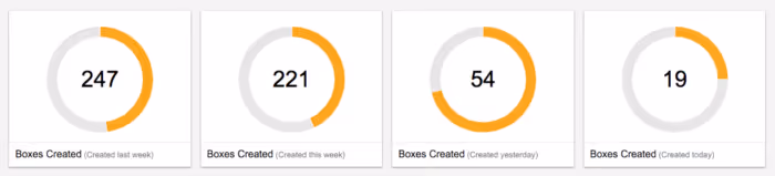
One basic metric we watch in our support@streak.com channel is the number of new boxes being created over time. In our support pipeline, each box represents a support need. An upward trend in volume indicates the need for more support resources. Below, we’ve used the ‘Boxes Created’ chart with ‘last week’, ‘this week’, ‘yesterday’, and ‘today’ so we can watch short term trends:
Drag and drop charts to reorder and customize your view
Once you start exploring your own data, you’ll want to rearrange the layout. Streak is always ready to adapt to your process! In our new reporting feature, reconfiguring your dashboard is just a click and drag away. Drag and drop supports both adding and rearranging your charts.

Sharing Reports
At this point, we imagine you’re adding, configuring, and rearranging your reporting to perfection. Digging into your own data is fun! After you’ve crafted your insights and are ready to show off, we’re happy to say that no matter how you want to share with your team, we’ve got you covered:
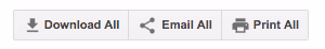
Download: Downloads high quality individual images of each chart in reports
Email: Creates an email and populates charts
Print: Creates a formatted page with charts and opens the ‘print’ screen
As we teased above, all-new charts are on the way! What information from your pipelines would you like to see in Reporting?
Stay in the loop with Streak’s latest features and insights.


